 |
| Unsplash.com |
Avoid clutter
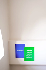
Use color, shapes, text, and images sparingly. While you can be ingenious to use the margins or drift off from the center, don't let the elements stay too close to each other unless it is intended. Choose only a few fonts and colors for a more direct effect. When people look at the design, their eyes must immediately go to your intended focal point instead of other elements.
It's all about balance.
 |
| Unsplash.com |
Graphic designers need to practice using symmetry when bringing elements together. Making the most even with a few elements is the essence of minimalism, whether it be in utilizing only the borders or just the allotted space. Minimalist designs make an impact because balance makes the message and the elements stand out. Balancing elements such as shapes, text, and color allows a design to look clean. The lack of balance sometimes emphasizes a design's intent or message. Keeping everything in balance in minimalism enables each part to serve its purpose.
Use empty spaces to your advantage.
Ram V Chary shares that negative or empty spaces can be intimidating, especially for those still getting used to minimalism. Going minimalist emphasizes keeping some portions of the work unfilled, whereas other design philosophies promote maximizing the gap. In minimalism, this unused space fosters harmony. This highlights the limited number of parts in the piece. Minimalism invites one to concentrate on the focal point at a time rather than dividing the viewer's attention to comprehend the work's message.
Be intentional in choosing colors.
In minimalism, an artist must limit their color palette. When choosing a color, remember that it must complement other features to make a concept, an image, or a message stand out. The other parts must match this. Colors must match whether it is bold or muted, says Ram V Chary. While many people think minimalism is just about using neutral colors, many minimalist designers have shown that bold colors can create a pleasing effect, primarily when it supports other shapes and texts.
No comments:
Post a Comment